The Internet Is Becoming More British
The web spent ten years looking “clean” just to end up clinically dead.
Now taste is back.
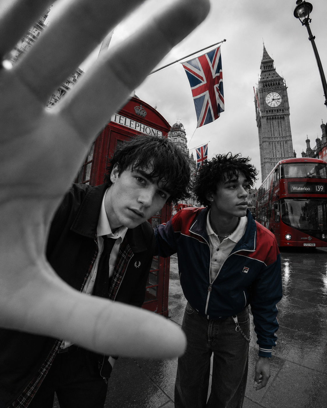
BY: TAYLOR & CROWNE
Images/Photos Sourced From: Taylor & Crowne, Lila Moss Burberry Campaign + Pinterest
For a while, every website wanted to feel finished.Perfect grids. Sanitised branding. Beige minimalism stretched across twelve screen sizes. Entire companies speaking in the same softened corporate voice as though legal departments had started writing copy for fashion brands.The internet became visually fluent and culturally dead at the exact same time.Now things are shifting again, although not in the way people think. Minimalism never disappeared. People just became bored of the bloodless version of it. The version obsessed with polish over point of view. The version where every creative decision had already been approved by somebody in performance marketing.What’s returning now is taste.Not loud branding. Not maximalism. Not chaos. Taste.

Fashion moved first, as it usually does. Websites started looking less “optimised” and more specific. Strange crops. Flash photography. Tiny type. Menus hidden where they probably shouldn’t be. Homepages that felt more interested in mood than conversion rates.And suddenly everything became more interesting to look at again.Hospitality followed shortly after. Restaurants stopped presenting themselves like investment opportunities and started looking like places people actually wanted to spend three hours inside. Hotels abandoned overproduced lifestyle videos in favour of imagery that looked almost accidental. Even small independent businesses began moving away from polished templates & towards websites with actual points of view.The shift feels British because British aesthetics have always understood the appeal of restraint mixed with personality. There’s usually something slightly off in the best British design. A crooked hemline. A brutalist building attached to a Georgian terrace. An expensive restaurant with typography that looks vaguely administrative.Perfection is rarely the point.That attitude is creeping back online now. People no longer want websites that feel frictionless in the Silicon Valley sense. They want evidence that somebody with taste actually made decisions. A strange transition. An oversized footer. A homepage that reveals itself slowly instead of screaming for attention immediately.Skill has become visible again.That’s really what’s changed.For years, good web design was measured by invisibility. Remove every obstacle. Simplify every interaction. Sand away anything remotely unusual. The result was an internet full of websites nobody remembered five minutes after leaving them.Now the websites people obsess over usually contain at least one unnecessary detail. Something indulgent. Something slightly impractical. Something included purely because it looks good.Which, oddly enough, is a very British idea.